30 Nov 2009

second draft of front cover.


- Second draft of front cover.

- Sexually attractive model.

- Bright blue/green background for contrast.

- Bar along the top to promote 2009 album charts.

- Bar diagonally placed across model.

- Small barcode in bottom right hand corner.

first draft of front cover.


- First draft of front cover.

- Sexually attractive model.

- 'Chart' resembles music. Also shows it is modern.

- Name of the model in large font.

- Arial Black is font I have used.

- Light blue background mixes in with what the model is wearing.

range of fonts.


Before I created my magazine, I created an A4 page with a range of fonts on and asked 30 people which one they prefered. They chose; Gills Sans Ultra Bold and Eras Light ITC. I have chose these fonts to use as they are bold and eye catching. These were also the favourite with the 30 people I asked.

26 Nov 2009

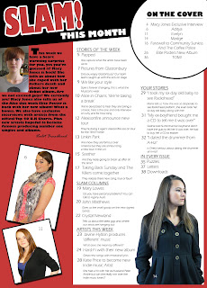
final draft of contents page.


- I have used red, black and white. I have used three main images on my contents page, and these also act as hooks, this makes the magazine eye catching.

- I cut out my models using the Magnetic Lasso Tool, Magic Wand Tool and Eraser tool. I put some models in white boxes. I chose to do this as it will draw attention to them, and I thought it looked to plain without the white background.

- The editors text is Gills Sans Ultra Bold at size 9. This is easy to read. The editor is signed the letter. I used Rage Italic for the signature.

- There is a model posing as the editor. The model is also sexually attractive.

- My hooks are under headings. Articles on the cover have a seperate compartment. This shows they are the main articles. I put these hooks in a white circle with a black stroke. The font I used is Eras Light ITC I made this a font size of 14.

- I have put the title on a black strip this is common on a magazine. The title is larger this showing it is the title of the contents page.

- I used the font Eras Light ITC at size 12 I made the headings bold and underlined them. Under each heading I have the title of the article I have used Eras Light ITC also at size 12.

- The numbers beside the hooks are Eras Light ITC, I made them bold, size 12. Underneath the titles I have ‘teaser comments’ letting people know a little more about the hook before they read it.

images used.


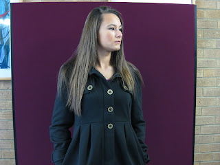
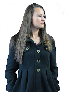
This is one of the main images i have chose to use for my contents page, I have decided to use this image as the model looks mysterious and interested in something. Also, my model is wearing black, which links in with one of the main colours of the magazine, this is popular in magazines.

I decided the image would look more professional if I cut the model out, this is a very common convention of a magazine. I used the Magnetic Lasso Tool, Eraser Tool and the Magic Wand Tool.

first draft of contents page.


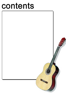
This is my first draft of my contents page, I have used an outline for which I would put my text, I have also put a picture of a guitar on the bottom right hand corner, this is to show the readers that this instrument is associated with the magazine genre. For the title, I have kept it plain. I used a bold black text so that it would stand out. I kept the background white so this would not intentionally draw attention away from the images or text.

research.


- One image.

- Simple and effective.

- Sections.

- Consistent colour scheme.

- White background.

- Main article in larger font.

- Arrows pointing to some hooks.

- Band index.

- Subscription at bottom.

research.


- Simple colour scheme.

- White background.

- One image.

- Two sections.

- Arrow to show more information on next page.

- Hooks.

25 Nov 2009

final draft of article.


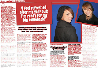
- Double page spread article I have put the Slam exclusive interview in the top left hand corner. Text in six columns of the same size makes it easy to read.

- Font size is 10, font is Gill Sans Ultra Bold clear to read.

- Two images of my model who also appears on front cover. Overlap with each other.

- Large white quote in red box overlapping picture of model. This shows a small portion of my article. Main text is rapped around this.

- White background. White with a red stroke 'A' at the beginning to help point out it is the beginning of the article.

macy jones interview.

This is my interview with Macy Jones for my article. This is linked to my front cover, the article is about the artists year out and about her fathers death. This will be my article.

After years of listening to Macy Jones’ music she has four number one albums and seven number one songs, we have been startled by her musical talent and it came as a huge shock when she announced she was having a break from the music business. We questioned whether she would return.
She has proven us wrong and is back bigger than ever, with an album under her arm to show her appreciation to her father.
Is there a new man in her life? Is she planning on settling down? How is she coping?
Macy Jones has brought tears to our eyes and butterflies to our stomachs with this warming yet upsetting interview. She sets the story straight about her binge drinking and apparent drug abuse. Why she really went into rehab.When we caught up with Macy Jones she told us about her fathers passing, her new album and what she has been doing for her year out of the business.


Your back! How do you feel?
I feel so refreshed I think it is just what I needed, I love music but it was taking over my life, a year out was marvellous!

But haven’t you been working on your album? So technically you were still working on music?
Yes, true, but I wasn’t in the limelight, you know, not at ceremonies, I was able to just sit in a room and write songs with my band creating the backing tracks.

Are you proud of your new album? Do you think it will make number one?
Not so much proud, well to be perfectly honest, if it made number one it be so happy, because I wrote all the songs to show appreciation for my father. [Catches breathe]

I’m sorry for your loss, how are you coping?
I’m good, just looking after the family, I cry now and then because he was my inspiration I wouldn’t be here today in the music business if he didn’t reassure me to do it. I’m keeping it together for the family.

It must be hard with all of the criticism lately too?
When my father died, I turned to drink, I didn’t become dependant on alcohol, but I got scared so I checked myself into rehab, it was a tough time, but I’m coping.

So you struggled but your ok now?
Yeah I feel better than ever my family have been so supportive, and I’ve found a new man. [Laughs] he is so gorgeous! [Giggles] don’t you think? Don’t answer that! He’s all mine.

So love is in the air?
Well it’s too early to say I love him but it’s too late to say I like him! He’s great to be around and he constantly makes me laugh. He does loads of sweet things like making the food to sending flowers to the studio. He is so adorable!

So he’s the chef?
Definately! He makes the best Spaghetti Bolognaise. [Laughs] he should open a restaurant.

Are you going to settle down with him?
It’s too early to say! Don’t ask serious questions! I’m here to have fun, I do love children though! I always play games with my neicesthey love hide and seek!

As you know X-Factor is a major subject in the headlines right now, how do you feel about that?
I think its great, it’s a easy way to make the public face reality, and shows people how much talent Britain actually has, I mean, I don’t sit and watch it 24/7, I’m not addicted but I think it’s a great way to start for a music career. It’s so publicised on Twitter. It is their realities, if you don’t like what’s happening, don’t watch it.


Who do you want to win?
That’s hard to say, I really like Stacey [Soloman] her personality is amazing and so funny, but at the same time Olly [Murs] is such a star, he can sing anything! Now that is real talent. [Pauses] I definitely think Simon Cowell will win this year though.

I’ve heard you’ve been sticking by Cheryl this year, what’s the story about that?
She feels like she can’t cope anymore, she doesn’t deal with Simon’s comments, it really gets to her, and she has so much on at the moment, Ashley’s court case, her new album and the show. She knows she’s doing all she can with the boys but Simon still says she’s not doing enough to make them shine. Dannii is also there for her, as she was there for Dannii last year. She’s just so under pressure, she knows I’m here for her if she wants to talk, she can talk. I won’t push her into anything. Make them shine. Dannii is also there for her, as she was there for Dannii last year. She’s just so under pressure, she knows I’m here for her if she wants to talk, she can talk. I won’t push her into anything.

As long as she has someone, tell us about your album!
Its out next month, most of the songs are for my father, as you know he passed away, and I just wanted to show people how much he meant to me. He was always there; I wouldn’t be here if it wasn’t for him encouraging me to just try, I’m thankful for that so the least I could do was write him an album, I just wish he was here to hear it. I’m sure he’s here somewhere. I can just feel him watching over me. Its so reassuring.

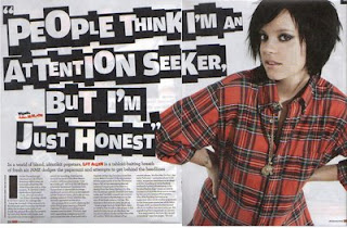
research.


- Double page spread.

- White background.

- Simple small black font.

- Three seperate articles on the side.

- White blue and black.

- Large 'T' at the beginning.

- Long distance shot of the band.

- Large picture.

- Large quote.

- Colourful title.

23 Nov 2009

research.


- Double page spread.

- White background with black font.

- Small black simple font.

- Normal article, no question answer.

- The title text is the same as the font on the front page.

- Title is a quote from the text.

- Very small paragraph which is bolder than the article.

- Large 'I’ at the beginning of the article.

- Article is in four columns.

- Large picture of artist.

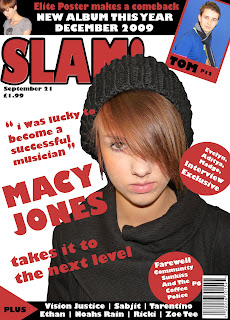
final draft of front cover.


- Models head is covering my title.

- Small barcode in bottom right hand corner.

- Issue number and price under title. Main story is highlighted as it is larger than other hooks.

- 'Plus' to show extra hooks. Hooks in circles. Bar along the top with a hook.

- Three colours: white red and black.

- The title has a strong stroke to help the title stand out. I also put an exclamation mark on the end of the word to emphasise the title; the word Slam is also onomatopoeic.

- The word slam is inspiration from a popular song (Pendulum – Slam) my music magazine is based on Drum and Bass, this song is also Drum and Bass.

12 Nov 2009

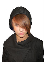
edited picture.


After deciding which picture to use I thought it would be best if I edited this photogragh. I have cut the model out by using the Magic Wand Tool, Magnetic Lasso Tool and also Eraser Tool. I have done this to make her stand out to make her look more sexually attractive, also to make the photograph look sharp. This is also a technique that professional magazines use.

picture chosen.


I have decided I will use this photograph of my model. I chose this one as she is inviting the audience to read the magazine and this particular pose fits in with the Music Magazine i would like to produce. She also has a mysterious pose and I think this would help my magazine become successful.

pictures.

After i chose my title I took photographs of the model i intend to use.


I like this photograph as she is inviting the audience in but she still looks mysterious. This picture is not too light and not too dark.


Although I like this photograph because of the pose, I feel like she is leaning too far forward. Also this photograph is too bright.


I like this photograph too but she doesn't look like she is interested I think this would effect my magazine badly. So i will not use this picture of my model.

11 Nov 2009

title options.


1 - Bevel and Emboss and a drop shadow.

2 - Bevel and Emboss and Stroke.

3 - White writing with red Stroke very strong Drop Shadow

research.


- Fergie as front cover model - popular artists

- Four colours; blue, black, gold and white

- Three fonts

- Title is bold and has a drop shadow

- The models head covers the name

- A website has been placed so the readers know if they need any additional information it is on the website

- Hooks aligned to the left and right of the model

- Hook above title, this is common

- Hooks for the magazine get smaller, as Fergie is the main attraction

- Hooks are 'name dropping' other artists

- Fergie is sexually posing inviting the audience into the magazine

research.


- Too simple.

- Model positioned to the right, not very eye catching.

- The model is inviting readers in.

- Models head is placed over the title.

- Model is too big as well as the hooks.

- Barcode.

- Two fonts.

- Three colours

research.


This issue of NME is very similar to the first version, although this one appears simpler to the eye. On this magazine cover, the title ‘NME’ is placed behind the head of the model on the front cover, this is a common convention of a well known magazine. The model on the front cover is a very attractive well know singer, she is also looking out to the audience inviting them to read the magazine. She almost has a playful look about her, making the readers more interested. This issue also has banners, one across the top and one along the bottom. This is also common on magazine covers. This issue has four colours of font, and four fonts, this is common for a magazine. This makes the magazine look simple and effective. I will take this into consideration. The barcode is not very big; it is placed in the bottom left hand corner of the magazine, thus keeping the article look professional as you don’t want the attention draw to the barcode.

research.


- Artists looking out the audience.

- Bevel and Emboss title to create depth.

- Stroke added to title to make it stand out.

- Four colours used.

- Banner across the top of the magazine advertising a page in the magazine.

- The alignment of the main hook is to the left of the cover.

- The other hooks surround the artist.

- Images with hooks.

questionnaire.

Next I decided I want to produce a Music Magazine, this consisting of a Front Cover, Article and Contents page.


I made a Questionnaire for people to take to help me decide what I would like my target audience to be, and what kind of music they listened to. This questionnaire was a big part of research and gave me a good starting point from which I could extend my ideas. All of the people I asked were asked anonymously took part in this magazine.


Questionnaire

How old are you?
[ ] Under 18
[ ] 18 – 24
[ ] 25 – 39
[ ] 40 – 55
[ ] 56 +
70% of the people I asked were under 18 years of age, 20% of the people I asked were 18 – 24 years old and the other 10% were 25 – 39 year olds.

What do you prefer to listen to your music on?
[ ] Ipod
[ ] Mp3 Player
[ ] Radio
[ ] Phone
[ ] Computer
[ ] CD’s
80% of the people I asked listened to music on either a computer or Ipod, the other 20% of people I asked listened to CD’s and the Radio.

What attracts you to a magazine?
[ ] Front cover
[ ] Adverts
[ ] Articles
[ ] Offers
[ ] Puzzles
All of the people I asked either said Articles or Front cover. 60% said just the front cover and 40% said both the front cover and the articles featured inside.

How much are you willing to spend on a magazine?
[ ] £1 - £2
[ ] £2 - £3
[ ] £3 - £4
[ ] £4 +
All of the people I asked said they would pay £1 - £2 for a magazine.


How often do you buy magazines?
[ ] Weekly
[ ] Fortnightly
[ ] Monthly
[ ] Never
30% of the people I asked said they bought magazines weekly, another 30% of the people I asked said they bought magazines fortnightly, the other 40% of the people said they only bought magazines monthly.

What type of magazine interests you most?
[ ] Sport
[ ] Music
[ ] Glamour
[ ] Film
[ ] Gaming
[ ] Real life
70% of the people I asked said they bought Music or Glamour magazines, the other 30% of the people said they bought magazines for the real life.

What kind of music do you like?
[ ] Pop
[ ] Rock
[ ] Jazz
[ ] Heavy Metal
[ ] Dance
[ ] Chart
[ ] R ‘n’ B
[ ] Rap
[ ] Punk
[ ] Blues
All of the people I asked ticked multiple boxes, 80% of the people said they liked to listen to Dance and Chart music, the other 20% of the people said they liked to listen to Chart and Indie music.

What sex model do you prefer to be on the front cover of a magazine?
[ ] Male
[ ] Female
90% of the people I asked said they preferred a female to be on the front cover of a magazine, only 10% preferred men on the front cover.

What would be a suitable name for my magazine?
[ ] Slam
[ ] Forte
[ ] Brio
[ ] Elegy
[ ] Note
70% of the people I asked said I should name my magazine ‘Slam’, 20% said I should name my magazine ‘Elegy’ the other 10% said I should name my magazine ‘Note’


What was the last CD you bought?

…………………………………………………………………………………………..
All of the people I asked said they recently bought a CD which had entered the charts in the past two months.

What are your favourite songs?

………………………………………………………………………………………………………………………………………………………………………………………………………………………………………………………………………………
All of the people I asked also said that their favourite songs had come from the recent charts. 70% of the people said there favourite songs came from the top 40 U.K charts from that week. The other 30% said there favourite songs were from the top 100 U.K charts.

What are the names of the magazines you currently read?

……………………………………………………………………………………………………………………………………………………………………………………
70% of the people I asked said they read either Closer or NME, 20% of the people said they read Kerrang and the other 10% said they read Pick me up.

Is there any other information you would like to tell me about magazines?

………………………………………………………………………………………………………………………………………………………………………………………………………………………………………………………………………………
All of the people I asked said they liked magazines to be colour with interesting hooks.

Front cover of Heworth Grange Magazine


This is my final draft of my Heworth Grange Magazine Cover. For my colour scheme I used three colours, dark blue, black and white, I used these colours as they represent the school colours and also blend in with what the model is wearing. I only used one font type, Cooper, and a font size of 18 but to make the font look interesting and stand out I put a stroke of size 4 around the text. I also put a drop shadow on the text so it did not look flat. I only used one colour for the hooks, black, and a dark blue for the magazine title, this also keeping within the colour scheme. I put a logo from the school beside the title of my magazine to show that the magazine is representing Heworth Grange Comprehensive School. For three of the tags I have used pictures beside them, I done this to make my cover look eye catching and also to let the audience know what to expect whilst reading the magazine. This is a common convention of professional magazines. For my model on the front cover, I used a sexually attractive model looking out to the audience, inviting them to read the magazine. The photograph has been taken at a medium shot and the model is posing as if she is about to dance, or just finished a dance, this blending in with two of the hooks on the front cover. The model is a female and centrally placed, this is a common convention of a magazine cover. I have no barcode and no price as I intend to make this magazine free; I intend to place them around the school area for pupils and teachers to have the chance to read the magazine, if it becomes a success I would think about adding a price to this product. I also have no slogan on this magazine cover but I did mention that it is ‘Issue 12’ this reminding pupils and teachers which month it was released, for example issue one would be for January, issue two would be for February.

Final Contents page


This is my final version of my contents page. I have reduced the size of font from 24 to size 12. For my editor’s piece I have been inspired by professional magazines such as ‘Mojo’ and decided to put a photograph of the editor beside the editor’s piece. At the end of the text I have used a script font, Brush Script MT to give a signature effect on the editor’s piece. I have used three images on the contents page with page numbers on them, this linking the pictures to the articles inside the magazine; I have used a different picture of the attractive model from the front of the magazine. On this picture she is also looking out to the audience inviting them to read the article she features in. I have also used two pictures from the front cover which reminds the audience of the articles inside. I decided to use a different font for the page hooks and page numbers. This font, Felix Titling, is easier to read and sticks to common conventions of professional magazines as they only use two to four fonts. For the page numbers I have added a drop shadow to make the page numbers stand out. I used sub-headings to divide the articles inside I used ‘On the cover’ to link the front cover to the contents page, also to make is easier for the audience to find what page an article is on that they may have been interested in on the front cover. I used another sub-heading, ‘Also featured inside’ to show the audience that there are more articles than just the hooks on the front cover. The colour scheme on my final contents page, also ties in with the colours of the school and are a common convention of a professional magazine as they only use two to four colours.