
12 May 2011


11 May 2011
10 May 2011
Evaluation
In what ways does your media product use develop or challenge forms and conventions of real media products?
When creating my advertising poster promoting my product I have chose to use and follow the conventions I have discovered throughout my research. These conventions are designing a large masthead and a symbol which my audience can connect to being the HMV dog. The reason being is so that that the audience is immediately informed what the poster is about and who’s promoting it. With my target audience being of the younger generation they wont be attracted to text heavy posters hence why I have used the short and snappy effect with my posters which is straight to the point. Colour is an important convention which I have used within my product. I want to attract and catch my audience which is why I used the colour code pink and yellow. They go nicely together which makes the mast head and writing stand out. Pink is one of HMV’s frequently used conventions which mean the audience can recognise this and is more likely to be read. I have titled my product in big bold letters so it’s easily noticed, labelling the price and where to purchase the product. These are all the main ingredients needed for my audience to go out and buy it. On this poster I have labelled HMV’s internet site where the product could also be purchased from advertising a more multi media purchase which will link my video to the actual digi-pack. Giving the audience more than one route to buy the merchandise will increase the chances of sales. 
To go alongside my HMV poster I have created a digi-pack for our music video, looking at various products like Cheryl Cole’s - Messy Little Raindrops, I used colour to connotate an emotion, this emotion is happiness and joy, I’ve achieved this affect by using film grain on the Joss layer, which I had used the paint brush to dye her hair pink, after the film grain I added text onto some of the digi-pack sticking to the colour scheme of purples, making the digi-pack become more obvious and not just some pictures for a CD.
Throughout the opening sequence and overall video there are a series of slow paced shots, bright lighting and a glamorous feel to the sequence which results in the audience being content. Strait away we are informed about their relationship as there is a sense of happiness and they are intimate with each other. A good example is the second scene on the steps. When looking at other music videos of the same genre such as ‘pink, f*ckin perfect’ i noticed that the audience are up to date with the story line within the opening sequence. In the happy scenes I decided to edit this to make seam like its a time form the past. I used the edit beach bypass to achieve this. Throughout scenes joss wears several outfits and different hairstyles. They have been used creatively to go alongside the emotion that’s wanted to be achieved. Also the main characters in music videos I have researched they wear glamorous clothing hence why joss chose to wear it in the studio scene’s. With the past and present scenes through out the music video different effects are used. The scenes always return to joss being in the studio which shows her reminiscing about past events. As joss is the main character I used the effect vignette so it made her the centre of attention. Also the positioning of her within the scene implies that she’s the main character.
Equilibrium
the first shot is us being welcomed by joss smile looking glamorous and powerful which then evolves to Joss and Steph hugging and kissing. We get the impression things are happy between the two but due to the effect we are informed that this scene is from the past. We see scenes of them holding hands going places together joking and laughing which gives off good vibes.
Disruption
the disruption that happened in my storyline is where Steph is talking to Joss but it’s just where he is singled out in this shot. Just by looking at his face how it’s positioned down and the dull lighting we can tell that what he is saying isn’t good. Joss then hastily pulls away her hand and turns away from him. There is also upset when joss receives a phone call and the reaction that we get we can tell that it isn’t good.
Realisation
The realization in the story is where Joss starts to get comforted by Sam. How we got this across is the scene after we see another shot of Joss receiving the phone call, this shot shows that Joss is clearly upset, and that Sam is doing her best to comfort her.
Resolution
The resolution part of Todorvs theory fits into out story quite nicely. They're both better dressed which is showing the connotation of happier emotions as they are willing to try now and forget the past. This represents the situation slowly being resolved by the lighting, location and costume.
New Equilibrium
The new equilibrium is where Joss and Sam realise they starting to have feelings for each other on the bridge, we showed this by scenes slowly building up showing greater happiness, for example the moment on the bridge when they are imitating the titanic, bringing them closer together. The bridge also represents that she is building a bridge over Stephen and walks off this bridge with Sam. This results in them kissing, and the video ends with them walking off the bridge in happiness and together.
What have you learned from your audience feedback?
Our target audience was the age range from 15 to 25, a lot of teenagers like dance music, which our questionnaire proved; this also explains our song choice. Also a reason we chose to use people of the age 15 to 25 is that a majority of them have a disposable income which they can spend on; music downloads, gigs, CDs, clothing and posters.
To capture our target audience’s eye, we had to use numerous conventions which they could relate to easily, if they see that Joss is wearing the same clothing or make-up for example as them, they wish they could aspire to be like them.
First of all we looked at clothing, hair and make-up: All of the actors wore trendy clothing, making them look glamorous, and generally you glam up to attend a party etc. Especially in the performance shots we made sure Joss had fancy clothing on, they will see this a form of identity and go out and buy the clothes she is wearing, to aspire to be like her. Joss also had several different styles of hair during filming, our target audience will be inspired by her hair, and this will make them want to copy her hairstyle, aspiring to be like her yet again, this is the same for make-up
Then I looked at locations: Locations are very important, we need to keep our audiences occupied, so if we just have a white room all the way through a dance video, it will not give the happy effect we are going for. Using plenty of locations gave us the opportunity to keep our audience interested as they'd loose interest if we just filmed on the Millennium bridge for example.
Story lining: In music/music videos it’s a common convention that love stories are incorporated into them. This is a good technique to use to capture an audience as nearly everyone will have some experience with something bad happening to them, in our case it is the fact that Joss was in love with Steph and he passed away, this causing her to turn to Sam for comfort. This then allows the audience to read into it in their own personal way as they have undoubtedly had something bad happen in a relationship etc. which allows them to relate to the music video in their own way.
After we made a showing of our music video, our target audience reactions were what we were expecting. Our audience was able to connect to our music video via the story line and use of shots and locations. They commented on the use of editing, which allowed the narrative to become clear, although mysterious during the first minute. They commented on the fact that they felt for Joss as Steph dies, and the burst of happiness when she realises her love for Sam.
If some feedback comes back negative we can use this to our advantage and not use the conventions that they have mentioned that didn’t work.
How did you use new media technologies in the construction of research, planning and evaluation stages?
Whilst creating our music video, album art and advert we had to use various technologies in the research, planning and evaluation stages. In the research part of this project we used a wide range of technologies such as the internet. The idea of the internet means that I become a ‘prosumer’, meaning I can consume the work of others but produce my own with a potential audience of millions who can provide feedback.
Using the internet I created  a blog, this blog is multimedia, consisting of text, images, videos and widgets. My blog was also free and public, which essentially allows people all over the world to view and comment on my music video. My blog allowed me to plan my research and work evenly, this making it more organised. The blog was also useful as if you didn't want your post published yet you were able to save a draft, and publish it when completed.
I was able to use YouTube during my research so I could research into existing music videos, as i had completed my music video, i was also able to create a channel on YouTube and broadcast my music video world wide, this also being free and enabling people all over the world to comment on my product.
Because I filmed our music video, I was able to enjoy the use of the Canon HD HG20, we had done a short task before filming to get used to the way the video camera works, and this prepared me for the shooting of the music video.
Also being in charge of the editing process I had a lot of decisions to make in the terms of effects and transitions, I was able to experiment with this on iMovie before we started our actual production of our music video.
Our music video consisted of memory shots, so to create the right effect I slowed down these shots and adding a beach bypass this told the viewer that they shots were in the past when she was happy. The majority of my transitions used were fades, this proved a great affect for the memory shots as it gives the sense of the past being slowly pushed out, and she’s making room for Sam, her new love.
On the music side of the editing, I thought I would get a better emotional response if I related some of the shots to the lyrics, two obvious moments for this is at the lyric ‘looking out for you to hold my hand’ I have used a shot of Joss sitting on some stairs in a confined area looking sad, as it says ‘out’ she looks up, hoping Steph is there. The other obvious part of this is ‘we could loose it all’, here I decided to create maximum effect I would use the shot of Joss visiting the tomb stone of where Steph has been buried. The most obvious shot of this is near the end where Joss and Sam kiss, here the lyrics ‘when love takes over’ are sung, this relating to the song title and the fact that Joss and Sam now have feelings for each other.
These lyrics were significant to my narrative so as the song built up I made the shots shorter and slowly brought them out of the beach bypass but keeping the Vignette on Joss as she performs in the studio.
How effective is the combination of your main product and ancillary texts?
The main goal when making J.Me a successful artist would actually mean making her known to the public. The primary goal of the band is to make money, so in order to do this; we want them to be recognizable and unique, we decided we would use a famous DJ just get her some cover, so we kept the name of David Guetta which would help promote her in itself. As, in the real music industry, we would be developing phrases, slogans and logos for the band, I also did so, making my product as real as possible. For my poster/advert I decided it would be a good idea to not have a text heavy design, so I kept the design plain an simple, using yellow and pink to make the advert stand out in the first place with a small picture of my front cover to show what the actual product is, with the price. The colours I have used in my ancillary tasks relate to the actual music video keeping these related will make it easier for my target audience to find a relation through the ancillary work.
I would be able to post my music video, audience feedback and audience reaction on YouTube which enables viewers to comment on and give their reaction, which is available all over the world, Facebook was a major part of my sharing, as I was able to share my ancillary work and videos all on the same page, allowing people to be able to see and comment on the work, realising the relation. The fact that I’ve used a social networking site to share my work, it allows people who have seen the work to strike up a conversation about it, effectively allowing them to encourage others to watch/look at the product.
I feel like I have been successful while creating our video production, we have stuck to common conventions of successful music videos such as Mike Posner – Cooler than me. Our singer/actor wore trendy clothes to attract an audience, also the clothing, hair styles and make-up she is wearing show connotations of a dance genre. Especially in the performance shot as our audience will aspire to be her by wearing the same glamorous clothes as her.
I am also happy with my ancillary tasks also, as my CD is set in the theme of purple, which makes people feel happy, also the images I have used on the digi-pack show she is dancing around, singing and is happy, which relates to the song, and the audience can relate to it making them also feel happy. This affect will encourage them to go out and buy our product.
When creating this video we went through the steps that professionals would use to create a successful media product. This included audience analysis; analyzing feedback, scouting for locations and analyzing existing media products. I have posted my progress onto a Blog which make me turn from a consumer to a ‘prosumer’ of media texts and now able to use Web 2.0 to access our audience effectively. With this production being on Blogspot it makes it easy to access and easy to share the production we have created, making our production available world wide.
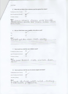
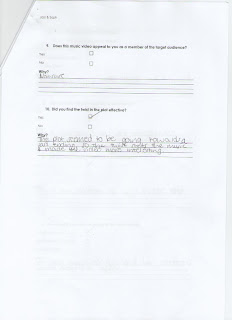
Questionnaire
This is our questionnaire that we produced for after the showing, we asked a selection of the group to fill out this questionnaire, this is one of the results. 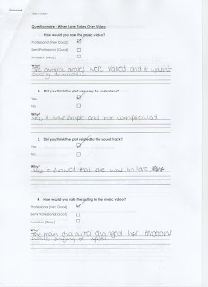
Sharing
This is a print screen of me sharing the video on YouTube across my Facebook page so that my target audience are aware of the fact that I've made a music video.
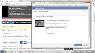
This enables them to be able to browse and comment on my video, giving me audience feedback.
With the fact that I've shared my music video on Facebook allows my target audience to be able to have easy access via mobile phones, which means it is more likely for my music video to be viewed frequently.
12 Apr 2011
Audience Feedback
After the showing of our music video, I took a couple of people to the side to ask them a couple of questions about the music video produced. Here is one sample of one of the people I asked to talk about my music video.
Audience Reaction
We decided we would show our video to our target audience, to enable this we choose a large group of people, ranging from 14 - 17, this is a similar fitting to my target audience. We recorded the reaction of our target audience as our film was coming to an end. You will see this in the clip below.
11 Apr 2011
6 Apr 2011
Research and Planning
Our music video is quite narrative, looking at the videos below has inspired us with our narrative.
We decided on the song being When Love Takes Over - David Guetta ft. Kelly Rowland,
we emailed the Labels, both Virgin and EMI asking permission to use this single.
After this we decided to use the narrative of a boy and a girl being in love, but the boy would have to leave, although he was about to leave then decided he would stay hence the 'When Love Takes Over'
This was jepodised with the male as he dropped out of filming, so after a long discussion we came to the conclusion that we would use Sam and have the her comfort Joss after the boyfriend had died, this resulting in a romance. Also using the connotation that the love has taken over.
12 Mar 2011
Poster

This is my poster to advertise my new music video, that has been released onto CD in HMV.
Pink and yellow clash making it stand out
colours resemble happiness
hmv sign to show who's promoting the product
not text heavy to make it eye catching yet informative
Bevel and emboss
stroke
drop shadow
image of cover
4 Mar 2011
Poster research
 When looking at this poster I can see that HMV use certain conventions when creating there posters. I can identify certain conventions they use, such as;
-Imagery relating to the product that is being sold
-picture of the actual album
-HMV dog which is known as there symbol which customers will recognise
-they use colour codes within there posters so that that individual parts of the poster
-stand out more, for example the pink writing through out my analysis of HMV posters the pink writing occurred in most of them.
-they use big bold writing so that it will catch the customer’s eye.
I have used these conventions within my work because they seem to work well in the real world.
28 Feb 2011


26 Feb 2011
Cover research
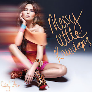
To create a realistic product the first step to take would to be to research and analyse other products from the same genre I'm targeting towards. This is to look at the conventions they use. The research that I am about to conduct is vital because it will give me examples on what to do and what not to do. The album cover creates a visual image to the theme of the music so its its vital that it has a good reaction from my audience to then draw them in to listen to the CD. Looking at the Cheryl Cole album cover I can see that by the colours that have been used in combination with her body language, clothing and editing its about a love story. She seems very relaxed she looks glamorous but weak due to the way she is sitting. Her clothing isn't revealing which means at this moment of time she isn't to confident with her self either. The fact that it has been blurred shows movement of some sort. This could reflect her moving on from a break up in a relationship. What also makes me think this is the title of the album which is 'messy little raindrops'. Rain doesn't have the best atmosphere and in a way it has the connotations of sadness. The colours that have been used within this album cover don't seem that lively. Most of the colours are quite dark which could also represent the mood. Taking what i have said into consideration i would say that this is a successful album art and with the combination of methods used above its gets its point across. The conventions used in this is that for the text it has hand writing. This could mean that the album could be personal like a letter of some sort. Having Cheryl taking up most of the album cover we automatically assume its about her.
16 Feb 2011
Complications!!
We've had some difficulty producing our music video due to the weather conditions in Newcastle. Being the locations manager I had to come up with a plan fast, so we came to the conclusion to record the performance inside, we have used a recording studio in our local Heworth City Learning Centre (CLC).
This picture gives you a inside view of our new facilities being using.
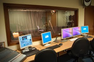
This picture gives you a inside view of our new facilities being using.
8 Jan 2011
Memory Filming
28 Nov 2010
17 Nov 2010
Location photographs
With our location planning we have decided to stay local, travelling the maximum of roughly five miles. Below are some pictures of ideas for location shots

Beside China Town, Newcastle Upon Tyne, city center, i choose this location to help us with the memory shots, as it is quite open, giving both Joss and Steph space to move, although they've chose to be close together and nothing can separate them.

Behind the gate, Newcastle Upon Tyne, city center, we chose this location as the emotional shooting area, as it is enclosed, making her feel lost and out of control.

The Gate, Newcastle Upon Tyne, city center, we chose Empire Cinema inside of The Gate as a good memory shot location, this could show that they've visited the cinema to see a romantic film and they've came out happy and loving, we were given permission to film in this location as it is an indoor public place.

Central Arcade, Newcastle Upon Tyne, city center, we thought this area would be a good place to do the 'chase' sequence but on the day of filming, we realised on the Canon HD HG22 the area was too dark and did not work to the effect we would of liked.
15 Nov 2010
Katy Perry - Thinking of You
Mike Posner - Cooler Than Me
- Duration of video: 4:36
- Gig scene
- Music begins at 1:00
- Cuts
- Zooms
- Desaturation
- Hand held camera
- Crescendo
- Everyone else is stood still until the bass kicks in
- Contrast in colour
- Party scene
- Use of camera to represent being drunk
- High angle, close up, over shoulder
- Scene showing a different time when parties were respected
- 3D effect
13 Oct 2010
David Guetta ft. Kelly Rowland - When Love Takes Over
This is the offical video of the song we have chosen to make our music video.
David Guetta ft. Kelly Rowland - When Love Takes Over
David Guetta ft. Kelly Rowland - When Love Takes Over
9 Oct 2010
Lyrics to When Love Takes Over
"When Love Takes Over"
(David Guetta feat. Kelly Rowland)
It's complicated, it always is, that's just the way it goes
Feels like I've waited so long for this, I wonder if it shows?
Head under water now I can breath, it never felt so good.
Cause I can feel it coming over me I wouldn't stop it if I could
When love takes over, yeah
You know you can't deny
When love takes over, yeah
Cause something's here tonight
Give me a reason I gotta know, do you feel it too ?
Can't you see me here on overload, and this time I blame you...
Ohhh... Looking out for U to hold my hand, it feels like I could fall
Now love me right like I know you can, we could loose it all
When love takes over, yeah
You know you can't deny
When love takes over, yeah
Cause something's here tonight
Tonight, tonight, tonight, tonight, tonight, tonight, tonight, tonight
Tonight, tonight, tonight, tonight, tonight, tonight, tonight, tonight
I'll be loving all the time, it's true
Cause I want to make it right with you
When love takes over,
When love takes over,
When love takes over,
When love takes over,
When love takes over,
When love takes over,
When love takes over,
Over, Over, Over, Over, Over, Over, Over, Over, Over, Over
When love takes over, yeah
You know you can't deny
When love takes over, yeah
Cause something's here tonight.
8 Oct 2010
Result in song
We've chosen the song David Guetta ft. Kelly Rowland - When Love Takes Over as it is a popular song amongst our target audience, we also believe we would be able to produce a successful production through the lyrics of the song, thus resulting in a strong narrative.
6 Oct 2010
Email to Virgin Records and EMI
This is a print screen of the email I have sent both Virgin Records and EMI


5 Oct 2010
Questionnaire results
After our results of the questionnaire, which we gave to our target audience to complete, we came to the conclusion that the Dance genre is the most common. This questionnaire also told us that Tinie Tempah and David Guetta were the most popular artists amongst our target audience. Our target audience like to watch music videos on the internet, this will result in me sharing our music video via the web for our target audience to view it once completed.
Questionnaire
This is my questionnaire to help use to distinguish which song we would choose.
R’n’B
Classic
Rock
Jazz
Punk
Blues
Pop
Dance
Country
Out of the following artists who do you prefer?
David Guetta
Black Eyed Peas
Cheryl Cole
Tinie Tempah
Bruno Mars
Mike Posner
Pink
Katy Perry
Out of the following songs which do you prefer?
David Guetta ft. Kelly Rowland – When Love Takes Over
Black Eyed Peas – Where Is The Love
Cheryl Cole – Promise This
Tinie Tempah – Pass Out
Bruno Mars – Just The Way You Are
Mike Posner – Cooler Than Me
Pink – F**king Perfect
Katy Perry – Thinking Of You
In your opinion, what is the most important feature of a music video?
The narrative
The shots
The music
The pace
Lip synchronization
What type of shots/camera movements/camera angles do you like to see in a music video?
Fast paced, action shots
Slow paced shots
Close ups
Long shots
Medium shots
Panning
Zooms
High angle shots
Low angle
Where do you watch music videos?
Television
Ipod
Internet
4 Oct 2010
Year 13 Video Production - Introduction
Before starting our research into either music or a horror trailer we decided which roles each person would take.
Joss :
- Actor
- Director
- Costume Make-up Props
- Continuety
Soph (Myself);;
- Storyboard
- Editing
- Fiming
- Locations
Joss :
- Actor
- Director
- Costume Make-up Props
- Continuety
Soph (Myself);;
- Storyboard
- Editing
- Fiming
- Locations
After this we decided we would choose a music video.
12 May 2010


evaluation.
1. In what ways does your media product use, develop or challenge forms and conventions of real media products?
When planning my media product, which was to create a monthly Indie Genre music magazine front cover, contents page and an article aimed at 15 – 25 year old females, I had to ensure my product was realistic; I carried out research so that I could base my work on other magazines. I looked through magazines such as NME (2009), Q (2005) and Blender (2008). A common convention of NME and Blender is that the titles of the magazines are placed behind the models head, thus telling the audience that the magazine is well known, and the style of the magazine is known to regular readers, I have used this technique on my media product to make it look more realistic.
On the front cover of many magazines, story hooks are justified down the left hand side and the right hand side, I have challenged this by only having one main hook, and the other hooks are placed in circles, which are randomly position on the front cover, to give it a more edgy look like on NME (2009).
The celebrity or model on the front cover was also often making eye contact with the camera to create a sense of curiosity within the buyer to ensure a sale; my model that is conventionally centrally positioned is posing this way, inviting the customer to read the magazine. Like other magazines, such as Kerrang (2009) I have chosen a sexually attractive model to help the magazine sell as women will aspire to be just like this celebrity.
The magazines I have researched have stuck to a common convention of using a limited number of colours, to follow this convention I have used three colours; red, white and black.
Like all of the magazines I have researched, I have a barcode on my front cover followed by a similar price to the magazines. I have a hook bar along both the bottom and top of my front cover, this making some of the hooks stand out. I have also used colloquial language such as slang to relate to my target audience which is 15 – 25 year olds.
For my article I have followed common conventions of using images throughout. My article is in the style of an interview, which is common of magazines such as Q (2009) and NME (2009). I chose to do my article like this is it appeals to my target audience because on my questionnaire narrow columns were preferred. Before the interview begins I have produced a small paragraph to tease the reader about what is in the interview. This is common of interviews within magazines. I have followed common conventions of most magazines by chosen to write my article in columns. I have also put page numbers on my articles as throughout magazines I have discovered page numbers mainly only appear on text pages. My layout for my article is mainly based on the layouts of NME (2009), NME also use quotes to hook the reader, and I have used this technique.
For my contents page I have mainly been inspired by NME (2009) and I have used the common convention of using the magazine title on the page followed by ‘this month’ also at the end of this I have produced a circle with hooks that have appeared on the cover, pointing out that these are the articles that invited them into the magazine. This is common within Reveal (2009). I have also decided to write up an editor’s letter which is common within many magazines such as New (2009). I have commonly placed page numbers beside my article headings; also underneath the headings I have used small sentences to hook the reader to the article. I have put these articles under sub headings, which is a common convention of NME (2009). Also on my contents page I have three photographs of models which link to three articles in the magazine. This is extremely common in magazines.
2. How does your media product represent social groups?
My media product mainly represents teenage females. I have targeted upper working class or lower middle class people; my article represents women in this class in a positive light as the article shows a female artist is succeeding in an industry, which is typically dominated by men, which my female target audience could relate to in a patriarchal society. The main celebrity is also someone they could relate to as the article shows how she had a lucky break, making the audience think how they might have the chance for their lucky break. The colour scheme is bold this helps women to relate to the article and person as red stereotypically shows connotations of passion and love, although men may also be able to relate to the colour scheme as it is bold.
3. What kind of media institution might distribute your media product and why?
Bauer media was bought from Emap, who publish worldwide and have an empire compromising of 282 magazines in 15 countries with an annual turnover of 1.79 billion Euros, where it is built on millions of personal relationships with readers. They connect to audiences with persuasive content. This is why I believe Bauer would be good to distribute my magazine as I would be widening the market for them, which will offer them an opportunity to expand their audience into a niche market of 15 – 25 year old females. Bauer is famous for being the owners of ‘Q’. This magazine is a different kind of music magazine to mine, but I feel like they would still like to publish my magazine as they are hoping for a wider market for a genre of music especially for females, like my magazine as it is aimed at the female Indie social group. This way the company can go for a new wider audience increasing their earnings. I think Bauer would be interested in my magazine, as most music magazines aren’t aimed at women so it would allow Bauer to tap into a new audience, which would increase their profits.
4. Who would be the audience for your media product?
For my media product my ideal audience would essentially be students ageing between 15 and 25 interested in the Indie genre of music, this is because they would be able to relate to the language used in my product as the Indie genre is becoming more popular. I also think my magazine would appeal to both sexes, although I have aimed it at a female audience men may also indulge in it also as I have not used typical ‘girly’ colours. I chose a unisex genre of music both genders listen to Indie, whereas if I had chosen ‘pop’ music it would have been more typically aimed at females as they are more likely to be interested in that. I also widened my age range to 25 as men typically don’t create a taste for music until their late teens, early twenties.
5. How did you attract/ address your audience?
First I attracted my audience by the title; the title of my magazine is SLAM! Which has connotations of the genre of music my magazine is based on as it is the name of a popular Indie bands song (Pendulum – Slam) I emphasised the word Slam with an exclamation point which is a noisy, forceful and energetic onomatopoeic word which appeals to the youthful audience. I attracted my audience by finding out what they looked for within a magazine by creating a questionnaire, then producing my magazine accordingly. I have used people in my magazine that are roughly the same age as my target audience but they are famous, thus enabling people reading the magazine to relate to them and aspire to be like them.
I used a sexually attractive model, and Naomi Wolf (1999) recognised in the ‘Beauty Myth’, that sexually attractive models are used to sell products to women, because they have been conditioned by patriarchal society to want to look like models so they buy the products because they aspire to be like the glamorous women. I have created a house style, which woman can relate to using a soft red, which can also attract males. I took into consideration some theory behind the sexually posed models used to grab the readers attention. I found that this was a typical convention of all the magazines I looked at on the shelves in nowadays such as Blender (2009).
My analysis of existing products and audience research enabled me to provide features and hooks for stories that my target audience would like; this allowed my magazine to be eye catching. The price of my magazine is £1.99 as during my research my target audience selected this price on my questionnaire; this is a reasonable price and attracts my audience to my magazine.
I am exploiting another aspect of Uses and Gratifications because my audience will select my magazine to find out information about bands/artists they’re interested in.
I am exploiting the Blumler & Katz theory of Uses and Gratifications as throughout my magazine I have used models roughly the same age as my target audience, thus gives a sense of identity as my target audience can compare themselves to the people in the magazines, this allowing them to relate to the problems within the magazine and aspire to be just like the celebrities. This is very common within magazines.
After my magazine pages were complete I decided to hand them out to 20 people that fit into my target audience. This is so I could see if my magazine would be capable to compete with existing music magazines. I received comments of almost all participants here are some examples of them;
Samantha Harber, 18, said ‘I think your magazine is able to compete with others as it is full of information that 15+ year olds would like to hear about music’
Jessica Smith, 22, responded with ‘I like how you have used a red to stand out from the black and white, I like how it is bold but soft; this attracts me towards the magazine’
Ben Moore, 15, smirked ‘I was attracted to your magazine straight away as your model is drawing me in with the pose I also think she is very pretty, the pose makes me feel welcome to your magazine’
Lauren Matthews, 25, admitted ‘I really enjoyed your article on Macy Jones, I felt it has helped me through some of my problems, I like your lifestyle take on music, this is much more interesting than just hearing about a local gig. I would definitely buy this magazine’
6. What have you learnt about new technologies from the process of creating this product?
I have learnt a lot of skills using Adobe Photoshop. For example I have learnt how to cut out models by using numerous tools such as Magnetic Lasso Tool, Lasso Tool, Pen Tool and Eraser Tool. I have learnt how to use a digital camera properly by using a tripod so that the pictures taken did not become blurry. During the process of making this magazine I have also learnt different effects on fonts. I learnt how to use Bevel and Emboss, Drop Shadow and Stroke to attract the reader’s eye. I have also learnt how to loose red eye in photographs using the Red Eye tool within Adobe Photoshop. On my photographs I have increased the brightness and the contrast of the models to help reflect them in a positive light and to stand out more, catching the readers’ eye. For my assignment I was asked to create a Blog which would keep track of my day to day progress of my product. Using a Blog has enabled me to change from a media consumer to a media producer, taking advantage of Web 2.0 I have been given the chance to reach an audience of millions possible.
7. Looking back at your preliminary task, what do you feel you have learnt in the progression from it to the full product?
Looking back to my preliminary task I have learned a lot about magazines, this is mainly because I had a lot more time to produce my final product. The time frame gave me time to be able to research into what my target audience would prefer within a magazine, I was also able to research existing products which allowed me to work out the standard of my competition I was competing with. I have also learned a lot about photo manipulation skills throughout my practical designing. I have also been able to create layout skills which will enable me to compete with existing products on today’s shelves. I have learnt how to make my music magazine look more professional compared to my prelim task as my prelim looks as if it was rushed and need more care whilst producing.
Lisa Stanford, 17 said ‘Your final music magazine product is much more eye catching that your prelim task, your prelim project looks as if it had little time to be completed whereas your music magazine looks as if it has had some time spent on it, not rushed.’
Realising that my prelim project looked rushed I learnt how to take more care and effort into photo manipulation to make my final product look more professional. Overall I think my final product has worked extremely well compare to my prelim project.
I also took audience research and feedback into account along with my analysis of existing products, I felt much more confident with the use of digital imaging software which enabled me to produce a magazine that correctly targets its audience and could be sold alongside existing music magazine such as NME, Blender, Q and Mojo. This is because I was aiming for a nationwide niche audience of 5000+ people as opposed to a very specific local audience of school pupils at one school in Gateshead so my analysis and research was very vital.
10 May 2010
flat plans.


These are the flat plans of my original design ideas.
I have changes these ideas as seen in earlier posts.
30 Nov 2009
second draft of front cover.

- Second draft of front cover.
- Sexually attractive model.
- Bright blue/green background for contrast.
- Bar along the top to promote 2009 album charts.
- Bar diagonally placed across model.
- Small barcode in bottom right hand corner.
first draft of front cover.

- First draft of front cover.
- Sexually attractive model.
- 'Chart' resembles music. Also shows it is modern.
- Name of the model in large font.
- Arial Black is font I have used.
- Light blue background mixes in with what the model is wearing.
range of fonts.

Before I created my magazine, I created an A4 page with a range of fonts on and asked 30 people which one they prefered. They chose; Gills Sans Ultra Bold and Eras Light ITC. I have chose these fonts to use as they are bold and eye catching. These were also the favourite with the 30 people I asked.
26 Nov 2009
final draft of contents page.

- I have used red, black and white. I have used three main images on my contents page, and these also act as hooks, this makes the magazine eye catching.
- I cut out my models using the Magnetic Lasso Tool, Magic Wand Tool and Eraser tool. I put some models in white boxes. I chose to do this as it will draw attention to them, and I thought it looked to plain without the white background.
- The editors text is Gills Sans Ultra Bold at size 9. This is easy to read. The editor is signed the letter. I used Rage Italic for the signature.
- There is a model posing as the editor. The model is also sexually attractive.
- My hooks are under headings. Articles on the cover have a seperate compartment. This shows they are the main articles. I put these hooks in a white circle with a black stroke. The font I used is Eras Light ITC I made this a font size of 14.
- I have put the title on a black strip this is common on a magazine. The title is larger this showing it is the title of the contents page.
- I used the font Eras Light ITC at size 12 I made the headings bold and underlined them. Under each heading I have the title of the article I have used Eras Light ITC also at size 12.
- The numbers beside the hooks are Eras Light ITC, I made them bold, size 12. Underneath the titles I have ‘teaser comments’ letting people know a little more about the hook before they read it.
images used.

This is one of the main images i have chose to use for my contents page, I have decided to use this image as the model looks mysterious and interested in something. Also, my model is wearing black, which links in with one of the main colours of the magazine, this is popular in magazines.

I decided the image would look more professional if I cut the model out, this is a very common convention of a magazine. I used the Magnetic Lasso Tool, Eraser Tool and the Magic Wand Tool.
first draft of contents page.

This is my first draft of my contents page, I have used an outline for which I would put my text, I have also put a picture of a guitar on the bottom right hand corner, this is to show the readers that this instrument is associated with the magazine genre. For the title, I have kept it plain. I used a bold black text so that it would stand out. I kept the background white so this would not intentionally draw attention away from the images or text.
research.

- One image.
- Simple and effective.
- Sections.
- Consistent colour scheme.
- White background.
- Main article in larger font.
- Arrows pointing to some hooks.
- Band index.
- Subscription at bottom.
research.

- Simple colour scheme.
- White background.
- One image.
- Two sections.
- Arrow to show more information on next page.
- Hooks.
25 Nov 2009
final draft of article.

- Double page spread article I have put the Slam exclusive interview in the top left hand corner. Text in six columns of the same size makes it easy to read.
- Font size is 10, font is Gill Sans Ultra Bold clear to read.
- Two images of my model who also appears on front cover. Overlap with each other.
- Large white quote in red box overlapping picture of model. This shows a small portion of my article. Main text is rapped around this.
- White background. White with a red stroke 'A' at the beginning to help point out it is the beginning of the article.
macy jones interview.
This is my interview with Macy Jones for my article. This is linked to my front cover, the article is about the artists year out and about her fathers death. This will be my article.
After years of listening to Macy Jones’ music she has four number one albums and seven number one songs, we have been startled by her musical talent and it came as a huge shock when she announced she was having a break from the music business. We questioned whether she would return.
She has proven us wrong and is back bigger than ever, with an album under her arm to show her appreciation to her father.
Is there a new man in her life? Is she planning on settling down? How is she coping?
Macy Jones has brought tears to our eyes and butterflies to our stomachs with this warming yet upsetting interview. She sets the story straight about her binge drinking and apparent drug abuse. Why she really went into rehab.When we caught up with Macy Jones she told us about her fathers passing, her new album and what she has been doing for her year out of the business.
Your back! How do you feel?
I feel so refreshed I think it is just what I needed, I love music but it was taking over my life, a year out was marvellous!
But haven’t you been working on your album? So technically you were still working on music?
Yes, true, but I wasn’t in the limelight, you know, not at ceremonies, I was able to just sit in a room and write songs with my band creating the backing tracks.
Are you proud of your new album? Do you think it will make number one?
Not so much proud, well to be perfectly honest, if it made number one it be so happy, because I wrote all the songs to show appreciation for my father. [Catches breathe]
I’m sorry for your loss, how are you coping?
I’m good, just looking after the family, I cry now and then because he was my inspiration I wouldn’t be here today in the music business if he didn’t reassure me to do it. I’m keeping it together for the family.
It must be hard with all of the criticism lately too?
When my father died, I turned to drink, I didn’t become dependant on alcohol, but I got scared so I checked myself into rehab, it was a tough time, but I’m coping.
So you struggled but your ok now?
Yeah I feel better than ever my family have been so supportive, and I’ve found a new man. [Laughs] he is so gorgeous! [Giggles] don’t you think? Don’t answer that! He’s all mine.
So love is in the air?
Well it’s too early to say I love him but it’s too late to say I like him! He’s great to be around and he constantly makes me laugh. He does loads of sweet things like making the food to sending flowers to the studio. He is so adorable!
So he’s the chef?
Definately! He makes the best Spaghetti Bolognaise. [Laughs] he should open a restaurant.
Are you going to settle down with him?
It’s too early to say! Don’t ask serious questions! I’m here to have fun, I do love children though! I always play games with my neicesthey love hide and seek!
As you know X-Factor is a major subject in the headlines right now, how do you feel about that?
I think its great, it’s a easy way to make the public face reality, and shows people how much talent Britain actually has, I mean, I don’t sit and watch it 24/7, I’m not addicted but I think it’s a great way to start for a music career. It’s so publicised on Twitter. It is their realities, if you don’t like what’s happening, don’t watch it.
Who do you want to win?
That’s hard to say, I really like Stacey [Soloman] her personality is amazing and so funny, but at the same time Olly [Murs] is such a star, he can sing anything! Now that is real talent. [Pauses] I definitely think Simon Cowell will win this year though.
I’ve heard you’ve been sticking by Cheryl this year, what’s the story about that?
She feels like she can’t cope anymore, she doesn’t deal with Simon’s comments, it really gets to her, and she has so much on at the moment, Ashley’s court case, her new album and the show. She knows she’s doing all she can with the boys but Simon still says she’s not doing enough to make them shine. Dannii is also there for her, as she was there for Dannii last year. She’s just so under pressure, she knows I’m here for her if she wants to talk, she can talk. I won’t push her into anything. Make them shine. Dannii is also there for her, as she was there for Dannii last year. She’s just so under pressure, she knows I’m here for her if she wants to talk, she can talk. I won’t push her into anything.
As long as she has someone, tell us about your album!
Its out next month, most of the songs are for my father, as you know he passed away, and I just wanted to show people how much he meant to me. He was always there; I wouldn’t be here if it wasn’t for him encouraging me to just try, I’m thankful for that so the least I could do was write him an album, I just wish he was here to hear it. I’m sure he’s here somewhere. I can just feel him watching over me. Its so reassuring.
research.

- Double page spread.
- White background.
- Simple small black font.
- Three seperate articles on the side.
- White blue and black.
- Large 'T' at the beginning.
- Long distance shot of the band.
- Large picture.
- Large quote.
- Colourful title.
23 Nov 2009
research.

- Double page spread.
- White background with black font.
- Small black simple font.
- Normal article, no question answer.
- The title text is the same as the font on the front page.
- Title is a quote from the text.
- Very small paragraph which is bolder than the article.
- Large 'I’ at the beginning of the article.
- Article is in four columns.
- Large picture of artist.
final draft of front cover.

- Models head is covering my title.
- Small barcode in bottom right hand corner.
- Issue number and price under title. Main story is highlighted as it is larger than other hooks.
- 'Plus' to show extra hooks. Hooks in circles. Bar along the top with a hook.
- Three colours: white red and black.
- The title has a strong stroke to help the title stand out. I also put an exclamation mark on the end of the word to emphasise the title; the word Slam is also onomatopoeic.
- The word slam is inspiration from a popular song (Pendulum – Slam) my music magazine is based on Drum and Bass, this song is also Drum and Bass.
12 Nov 2009
edited picture.

After deciding which picture to use I thought it would be best if I edited this photogragh. I have cut the model out by using the Magic Wand Tool, Magnetic Lasso Tool and also Eraser Tool. I have done this to make her stand out to make her look more sexually attractive, also to make the photograph look sharp. This is also a technique that professional magazines use.
picture chosen.

I have decided I will use this photograph of my model. I chose this one as she is inviting the audience to read the magazine and this particular pose fits in with the Music Magazine i would like to produce. She also has a mysterious pose and I think this would help my magazine become successful.
pictures.
After i chose my title I took photographs of the model i intend to use.

I like this photograph as she is inviting the audience in but she still looks mysterious. This picture is not too light and not too dark.

Although I like this photograph because of the pose, I feel like she is leaning too far forward. Also this photograph is too bright.

I like this photograph too but she doesn't look like she is interested I think this would effect my magazine badly. So i will not use this picture of my model.
Subscribe to:
Posts (Atom)