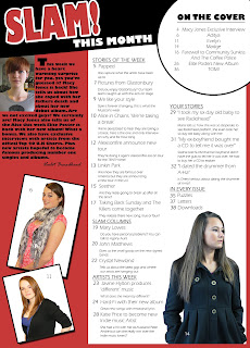
- I have used red, black and white. I have used three main images on my contents page, and these also act as hooks, this makes the magazine eye catching.
- I cut out my models using the Magnetic Lasso Tool, Magic Wand Tool and Eraser tool. I put some models in white boxes. I chose to do this as it will draw attention to them, and I thought it looked to plain without the white background.
- The editors text is Gills Sans Ultra Bold at size 9. This is easy to read. The editor is signed the letter. I used Rage Italic for the signature.
- There is a model posing as the editor. The model is also sexually attractive.
- My hooks are under headings. Articles on the cover have a seperate compartment. This shows they are the main articles. I put these hooks in a white circle with a black stroke. The font I used is Eras Light ITC I made this a font size of 14.
- I have put the title on a black strip this is common on a magazine. The title is larger this showing it is the title of the contents page.
- I used the font Eras Light ITC at size 12 I made the headings bold and underlined them. Under each heading I have the title of the article I have used Eras Light ITC also at size 12.
- The numbers beside the hooks are Eras Light ITC, I made them bold, size 12. Underneath the titles I have ‘teaser comments’ letting people know a little more about the hook before they read it.
No comments:
Post a Comment